Do My Friends Care About Me?
A Brief Analysis of my Facebook Friends
This was a (not so) quick look at how I stacked up against my Facebook friends in a totally arbitrary measure.
I looked at the ratio of likes and reacts (henceforth to be referred to as a singular entity: “realikes”) to a user’s profile picture to that user’s friend count. That is, what percentage of a user’s friends realiked his or her profile picture?
Gathering Data
I’ll post a more detailed write-up of the technical aspects of scraping the Facebook profiles, as well as an iPython Notebook with the code.
The most challenging (and time consuming) part was gathering the data. I ran into several dead ends before finally scraping the data from Facebook using Selenium. I’ll go through all of the failed methods and my succeessful method here.
I had already collected a list of Facebook profile URLs just using Chrome Dev Tools on the client side.
My first idea was to use the Facebook Graph API. However, that quickly proved to be impossible, mainly because this StackOverflow answer said so.
So on to the second solution! I figured I could use the python requests and beautifulsoup libraries to crawl Facebook, and just pass in my Facebook cookies for auth. While the authentication totally worked (exciting!), I discovered that Facebook does basically all of the rendering client side, so the HTML that I received was just a bunch of links to async scripts.
Ultimately, I resorted to Selenium to scraping first the links to profile pictures, and later, the actual realike counts.
Examining the Data
After a little bit of cleaning up in Excel, I was ready to take a deeper look at the data.
# Import our beloved libraries

import pandas as pd
import numpy as np
import matplotlib.pyplot as plt
# Read in the data

data = pd.read_csv('./data.csv')
# View the first 5 entries

data[:5]
| # Likes on Pic | # Friends | |
|---|---|---|
| 0 | 77.0 | 321.0 |
| 1 | 137.0 | 527.0 |
| 2 | 176.0 | 563.0 |
| 3 | 54.0 | 898.0 |
| 4 | 103.0 | 283.0 |
# This includes "bad" rows, which don't have values for either or both of the columns
len(data)
# Drop the bad stuff
data = data.dropna()
len(data)
plt.plot(data['# Friends'], data['# Likes on Pic'], 'bo')
plt.title('Realikes to Friend Count')
plt.ylabel('Realikes')
plt.xlabel('# Friends')
<matplotlib.text.Text at 0x115283f28>

There seems to be a general upwards trend, with users with more friends receiving a greater amount of likes from friends. This makes sense, since their pictures go out to a larger audience. I am more interested in the ratio between the realike count and friend count.
Looking at the Realike Ratios
# Insert new column of the ratios.
data['Ratio'] = data['# Likes on Pic'] / data['# Friends']
# First look at the ratios! Just a brief summary.
data['Ratio'].describe()
count    278.000000
mean       0.158833
std        0.093243
min        0.000000
25%        0.083202
50%        0.159469
75%        0.220952
max        0.492114
Name: Ratio, dtype: float64
Ok, so this summary provides some interesting information.
Just from clicking around Facebook earlier, I had thought that the average ratio would be somewhere between 20% and 30%, but it ended up being much lower, at 15.9%.
Also interesting to note is that no one had over half of their friends like their profile picture, although the max of 49.2% came pretty close.
# Sort data by friend count
data = data.sort_values(by='# Friends')
%matplotlib inline

plt.plot(data['# Friends'], data.Ratio, 'bo')
plt.xlabel('# Friends')
plt.ylabel('Ratio')
plt.title('# Friends vs Realike Ratio')
<matplotlib.text.Text at 0x113fc76a0>
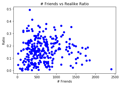
One of the biggest things I was hoping to see was a correlation between friend size and ratio. However, that did not really manifest itself. As you can see, the points are relatively evenly distributed.
# Top 5 realike ratios.
data.sort_values(by='Ratio', ascending=False)[:5]
| # Likes on Pic | # Friends | Ratio | |
|---|---|---|---|
| 8 | 156.0 | 317.0 | 0.492114 |
| 11 | 155.0 | 376.0 | 0.412234 |
| 158 | 280.0 | 742.0 | 0.377358 |
| 4 | 103.0 | 283.0 | 0.363958 |
| 12 | 406.0 | 1118.0 | 0.363148 |
# Bottom 5 realike ratios.
data.sort_values(by='Ratio', ascending=True)[:5]
| # Likes on Pic | # Friends | Ratio | |
|---|---|---|---|
| 92 | 0.0 | 125.0 | 0.000000 |
| 40 | 0.0 | 117.0 | 0.000000 |
| 299 | 1.0 | 370.0 | 0.002703 |
| 57 | 2.0 | 539.0 | 0.003711 |
| 89 | 6.0 | 826.0 | 0.007264 |
Viewing the lowest 5 realike ratios reveals that those with the lowest friend counts do not have the lowest realike ratios.
Does Friend Count Matter?
I then took a look at the distributions for users with more than 1000 friends compared to users with fewer than 1000 friends.
It’s important to note that there are significantly more users with fewer than 1000 friends in my data set.
gt1000 = data.loc[data['# Friends'] >= 1000]
lt1000 = data.loc[data['# Friends'] < 1000]
len(gt1000)
gt1000['Ratio'].describe()
count    44.000000
mean      0.173164
std       0.084129
min       0.008739
25%       0.116832
50%       0.180046
75%       0.219244
max       0.363148
Name: Ratio, dtype: float64
lt1000['Ratio'].describe()
count    234.000000
mean       0.156139
std        0.094783
min        0.000000
25%        0.072971
50%        0.155958
75%        0.220952
max        0.492114
Name: Ratio, dtype: float64
The mean ratio for those with > 1000 friends is a little bit larger than those without, as is the median.
%matplotlib inline

plt.figure(figsize=(12, 4))

plt.subplot(121)
plt.plot(lt1000['# Friends'], lt1000['Ratio'], 'ro')
plt.plot(gt1000['# Friends'] - 1000, gt1000['Ratio'], 'bo')

plt.xlabel('# Friends')
plt.ylabel('Realike Ratio')
<matplotlib.text.Text at 0x1140b42e8>
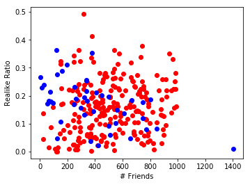
This plot might be a little bit confusing. The red dots represents users with fewer than 1000 friends. The blue dots represents users with 1000 or more friends, but the dots are scaled so as to align with the red dots (by subtracting 1000 from the friend count).
What does this reveal? Not much. There are more red dots in the upper right corner than blue dots, but the points are spread evenly enough where this is insignificant.
Looking at Friend Counts
As an aside, I took a look at the distribution of friend counts.
data['# Friends'].describe()
count     278.000000
mean      656.589928
std       395.612176
min        22.000000
25%       371.750000
50%       564.500000
75%       841.750000
max      2403.000000
Name: # Friends, dtype: float64
Conclusion? My friends, on average, have twice as many friends as I do. Sad.
plt.figure(figsize=(16, 8))

plt.subplot(121)
plt.boxplot(data['# Friends'])
plt.ylabel('# Friends')

plt.subplot(122)
plt.hist(data['# Friends'], bins=20)
plt.ylabel('Freq.')
plt.xlabel('# Friends')
plt.title('How Many Friends My Friends Have')
<matplotlib.text.Text at 0x114f552b0>
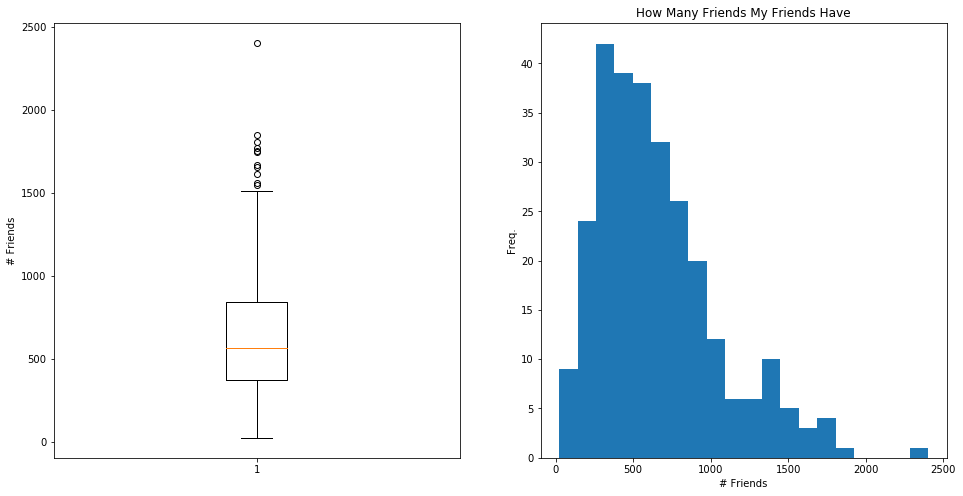
As shown by the box plot and, perhaps more obviously, by the histogram, the distribution of friend counts is skewed right, accounting for the large difference between mean friend count and median friend count. Either way, I look to be pretty anti-social.
Conclusions?
I can’t really draw any statistically significant conclusions from these data. That said, there were some trends that were insightful or interesting to some extent.
Quality over Quantity
It’s apparent that having a higher friend count does not necessarily result in a higher realike ratio. For 4 of the top 5 ranked realike users, the friend count was below the third quartile. In fact, the user with the highest friend count (2403 friends) had one of the lowest ratios (.8%)
That said, by examining the bottom 5, almost all were below the median friend count. This seems to imply that having too few friends is also not ideal.
Given these very broad generalizations, one can make the logical ssumption that there is a “Goldilocks zone” of friend count that yields that highest ratio. However, the data is probably much to scattered to be able to actually generate a useful model.
An Individualized Analysis
This data set was composed of only my friends. This meant the data set was tailored uniquely to my choice of friends, which are mostly high schoolers in the NOVA area.
Next Steps
There are quite a few paths in which I can proceed with this little experiment, if I want to. For one thing, it would be great to acquire more data, and, now that I think of it, generally profile pictures and friend counts are public, so I could expand the data set to beyond my friends.
Looking at the contents of the profile picture would also be interesting. For example, in pictures that were especially popular, were there multiple people? What is the gender / age / etc of the subject? However, this will be a much more nontrivial task.