About this Site - Design
Getting Started
After getting an idea of what I wanted to accomplish with the site (which I detailed in the previous post), I was ready to begin designing.
Table of Contents
Sketching
I normally start out with sketching some ideas. Conveniently, I was going to Seattle for winter break, so the hours on the flight sans internet was well-used.
I find sketching to be useful for figuring out layout and the flow of content. I was now ready to start making some mockups.
Mockups
I use Affinity Designer for all of my computer graphics work. I used to use Adobe Illustrator before I switched computers, and the overall workflow is very similar, which meant a pretty low learning curve for the transition.
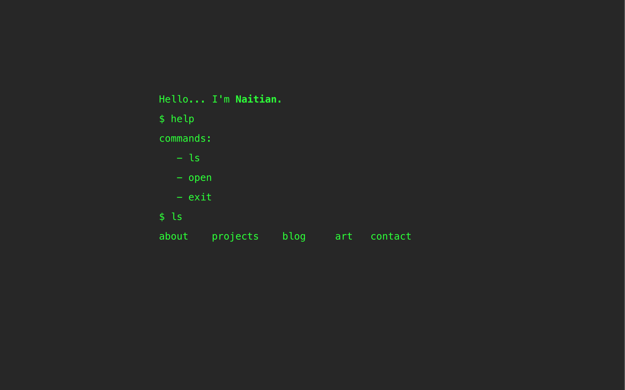
Home
I started with the home page. I tried to keep it simple, and allow it to act as a hub to all of the other pages.
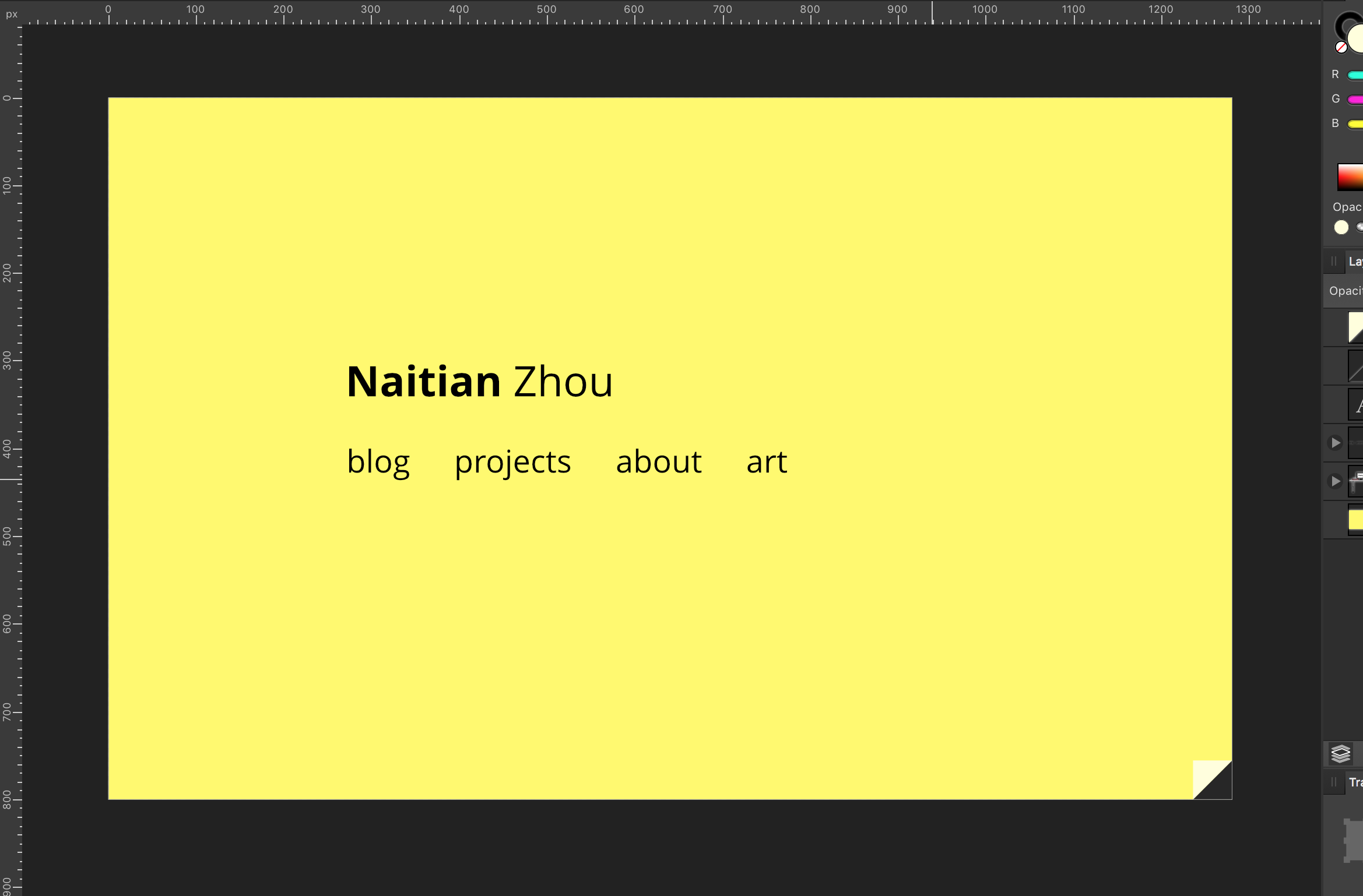
I also wanted to keep the terminal, and ultimately decided on adding a little flip tab to reveal the “inside” of the site.
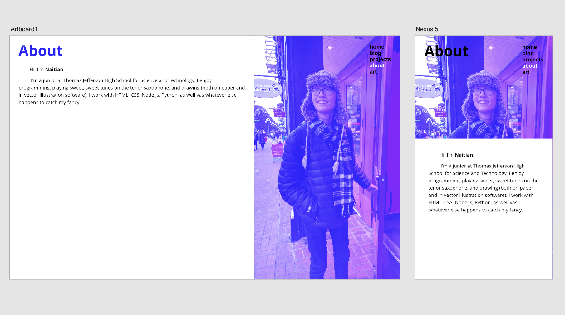
About
One of the first conditions for the About page was that I had to include a picture of myself. However, images always raise the risk of disrupting the stylistic consistency (especially when the photo isn’t that good). I eventually decided to add an overlay of the theme color.
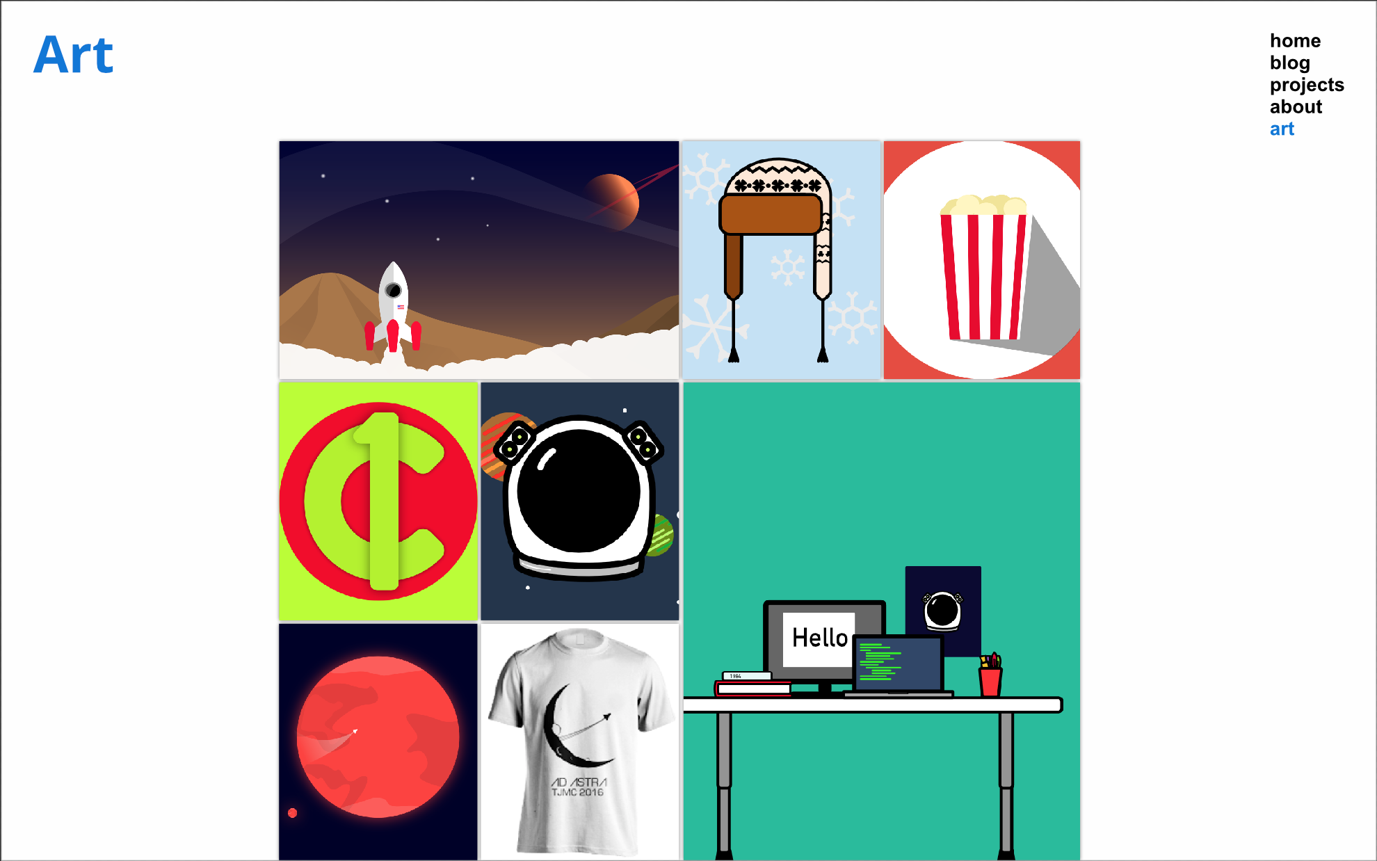
Art
A huge reason for the redesign of the site was because I wanted a place for me to show off the things that I draw and design. This is where the design things got interesting.
For the home page of the Art section, I wanted to keep it as a simple mosaic layout, without any text. In fact, in the original design, I had envisioned tiled and interlocking blocks. The goal was to have a wall of art, and clicking on one would lead you to a page explaining the piece in greater detail.
This detail page was more interesting to work with. I wanted to cast attention primarily upon the work, so I chose a dark background. The piece is displayed prominently as the first item, but underneath is the same layout as a blog post.
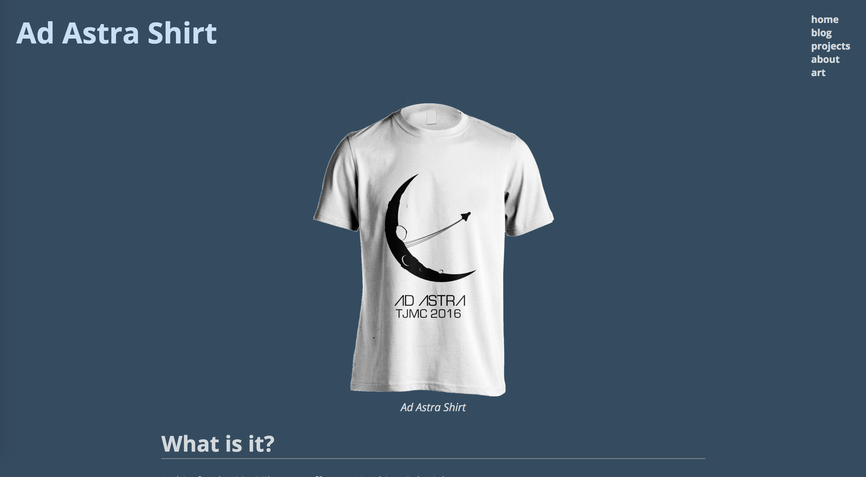
This is probably the least polished part of the site. Some concerns I have about the details page is how the colors might clash. The current color is far from neutral.
Blog
I wanted to keep the blog as a separate entity from the rest of the site. This informed some of my decisions, such as having the navigation at the root of the blog be a “go to website” button, instead of the nav bar as shown on the rest of the site.
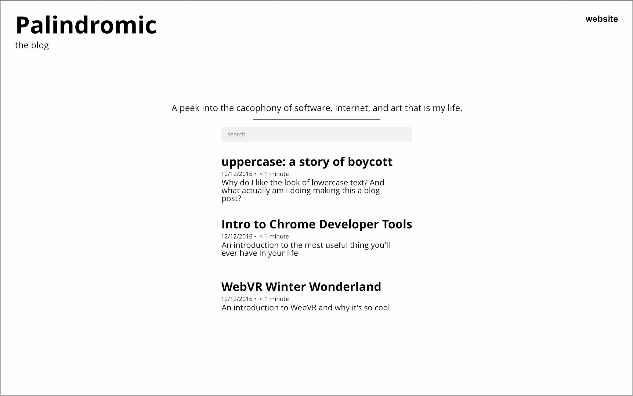
The blog is mainly text-based, so I stuck to a black and white color scheme, like ink on paper. I’m satisfied with the very minimalist aesthetic.
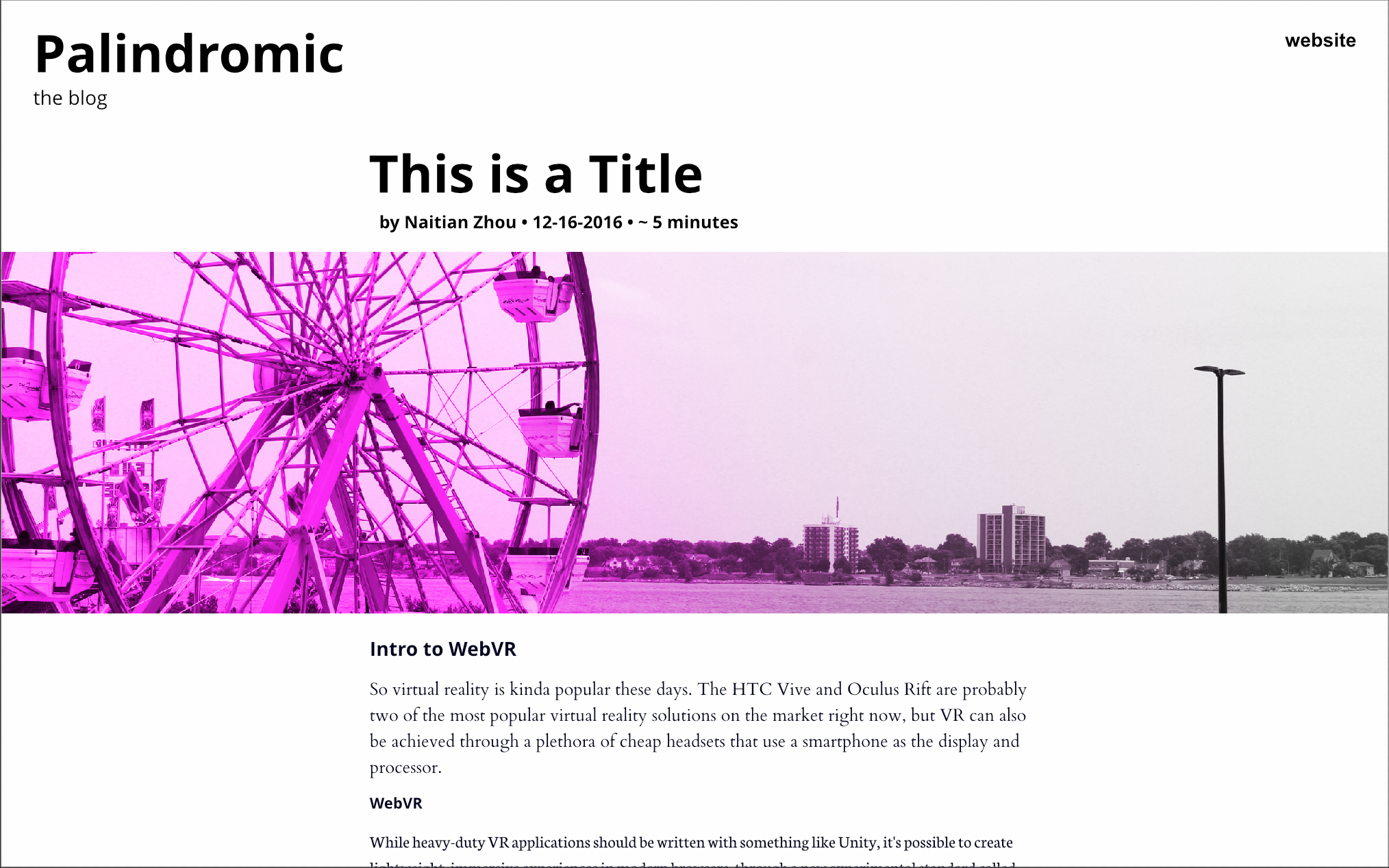
I struggled more with the page of an article. I had a couple of choices to make.
- Typeface:
- I planned on initially using two typefaces: Open Sans for headers, and a serif typeface for body text. However, it looked kind of busy, so I ultimately decided against it. I may revisit the idea in the future, though, because I kind of like the look.
- Cover photo:
- I was unsure of how I would handle cover images. Initially, I planned on making the cover images fit into the width of the article, but I ended up preferring the expansive feeling of having the image stretch across the entire width of the screen.
Projects
I probably struggled with the Projects page the most. I tried 5 or 6 different card designs before settling on one that I liked. I played around with working project-specific colors into each card, but I figured that would be too busy.
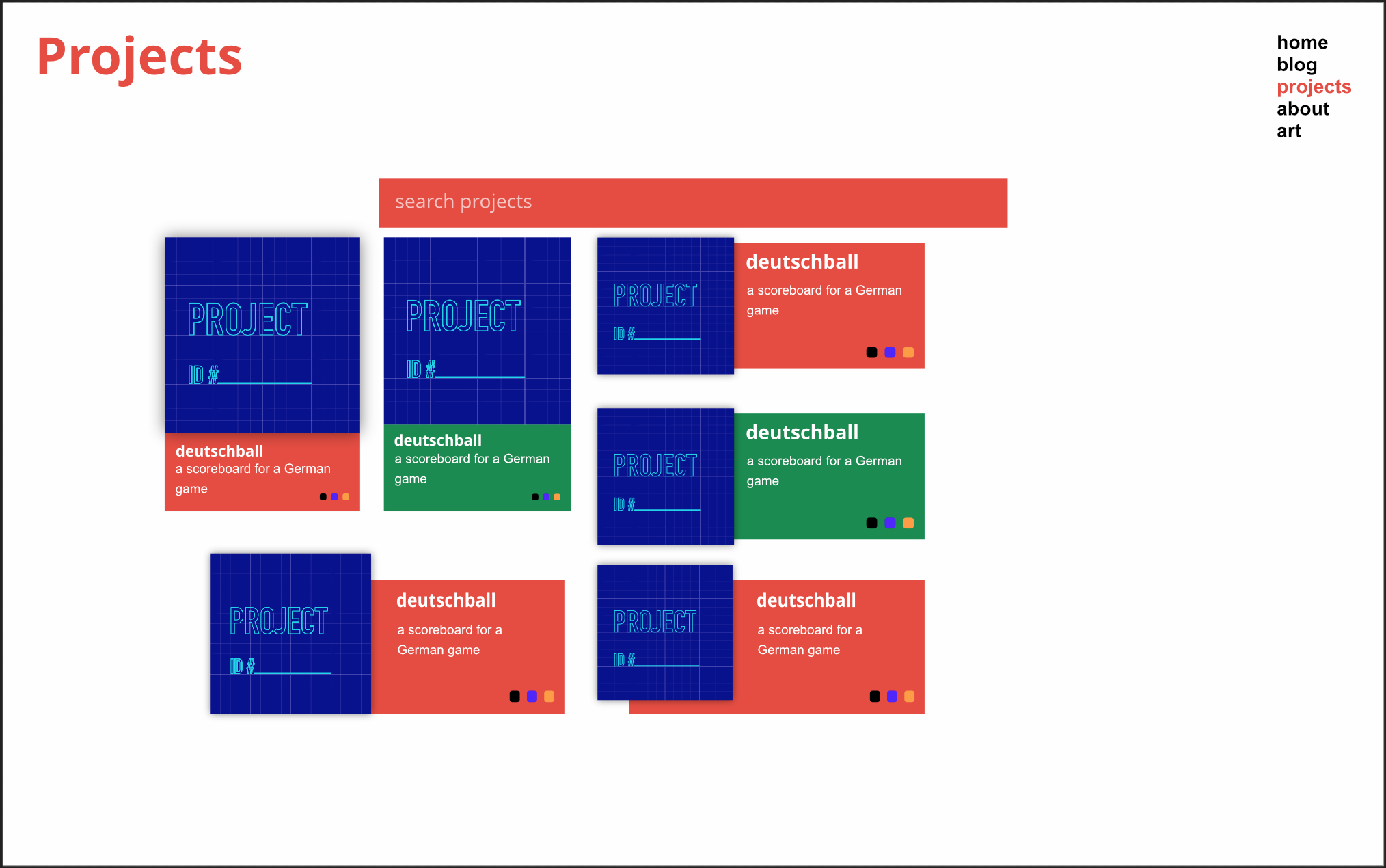
I added a subtle drop shadow just to keep things interesting.
Post Mortem
Overall, I’m very satisfied with the design of this site. Nonetheless, there are still a couple of things that I may change in the future.
- Art Detail Page
- As I previously alluded to, I’m not entirely satisfied with the design of this page. I have two main concerns.
- I’m not happy with the color choice. It looks kind of muddy, and doesn’t really allow the pieces to stand out that much.
- The presentation of additional images is flawed, especially since some images don’t contrast as well against the background, and they’re currently very small without a way to zoom in on them.
- Project Cards
- I’m still not entirely sold on the design of the project cards. I think the presentation is a bit too plain.
- Blog Post
- Font color is something I’m still working on with the blog. The color of links is harsh, and stands out too much. The pure black text on a pure white background also seems jarring. However, I like how sharp it feels with that much contrast.
- The Table of Contents needs to be dealt with to make it more interesting, or at least more visually appealing.